

Plot Raw Curves
try:
    import cdk
    print("CDK already installed, skipping installation and restart.")
except ImportError:
    !pip install nucleus-cdk -q > /dev/null 2>&1
    print("\nInstallation complete. Restarting runtime to refresh dependencies...")
    import os
    os._exit(0)
CDK already installed, skipping installation and restart.
import pandas as pd
pd.set_option('display.max_columns', None)
import seaborn as sns
import matplotlib.pyplot as plt

# Import the cdk platereader module
from cdk.instruments import platereader as pr

from cdk import logging
log = logging.setup_logging(logging.ERROR)
%%writefile drive_utils.py
import os
import re
import gdown
def get_drive_file_id(url):
"""Extract the file ID from a Google Drive share URL."""
match = re.search(r'/d/([a-zA-Z0-9_-]+)', url)
if match:
return match.group(1)
return None
def download_from_drive(files_info, destination_dir):
"""
Download files from Google Drive.
Args:
files_info (list): List of dicts with 'url' and 'filename'.
destination_dir (str): Local path to save files.
Returns:
dict: Mapping of filenames to local paths.
"""
os.makedirs(destination_dir, exist_ok=True)
paths = {}
for item in files_info:
url = item['url']
filename = item['filename']
dest = os.path.join(destination_dir, filename)
file_id = get_drive_file_id(url)
if file_id:
gdown.download(id=file_id, output=dest, quiet=True)
else:
gdown.download(url, output=dest, quiet=True)
paths[filename] = dest
return pathsOverwriting drive_utils.py
# Set use_drive = True to download data_file and platemap_file from Google Drive instead of
# using local files. Each Drive file must have its permissions set to "Anyone with a link" can "view".
use_drive = True

if use_drive:
    from drive_utils import download_from_drive

    files_to_download = [
        {
            "url": "https://data.nucleus.engineering/platereader/devstudio/20261001-181311-cytation5-pure-timecourse-gfp-JM-MB-Mg-Osmo-Sweep.txt",  # Replace with your data file link.
            "filename": "raw_data.txt",
        },
        {
            "url": "https://drive.google.com/file/d/1LybPWStJZuQV_b4cguMsLfphb3EghDhk/view?usp=sharing",  # Replace with your platemap file link.
            "filename": "platemap.csv",
        },
    ]
    downloaded_paths = download_from_drive(files_to_download, destination_dir="data")
    data_file = downloaded_paths["raw_data.txt"]
    platemap_file = downloaded_paths["platemap.csv"]
else:
    data_file = "sample-data/20251111-122213-cytation5-pure-timecourse-gfp-MFG-98-tRNA-QC.txt"
    platemap_file = "sample-data/platemap.csv"

print(f"Data file: {data_file}\nPlatemap file: {platemap_file}")
Data file: data/raw_data.txt
Platemap file: data/platemap.csv
# Load data
result = pr.load_platereader_data(
    data_file=data_file,
    platemap_file=platemap_file,
    platereader="biotek" # options: "biotek"
)print(result)PlateReaderResult with the following 2 blocks:
0: (1168, 37) kinetic read with reads: GFP-G70:485,528 (Fluorescence) (Plate 'Plate 2')
1: (1168, 37) kinetic read with reads: GFP-Gext:485,528 (Fluorescence) (Plate 'Plate 2')
desired_index = 1
data = result[desired_index]data.view().head()Plot Raw Curves
data.plot()<seaborn.axisgrid.FacetGrid at 0x7934c423eba0>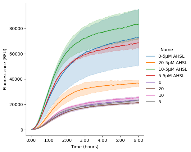
data_0 = data.select(name=["0-5µM AHSL", "0" ])
data_5 = data.select(name=["5-5µM AHSL", "5" ])
data_10 = data.select(name=["10-5µM AHSL", "10" ])

df_0 = data_0.data
df_5 = data_5.data
df_10 = data_10.data

fig, (ax1, ax2, ax3) = plt.subplots(1,3, figsize=(15,5.5), sharey=True)

for df in [df_0, df_5, df_10]:
    df['Time_hrs'] = df['Time'].dt.total_seconds() / 3600

sns.lineplot(df_0, x="Time_hrs", y='Data', hue="Name", ax=ax1)
sns.lineplot(df_5, x="Time_hrs", y='Data', hue="Name", ax=ax2)
sns.lineplot(df_10, x="Time_hrs", y='Data', hue="Name", ax=ax3)

ax1.set(xlabel='Time (hrs)', ylabel='RFU')
ax2.set(xlabel='Time (hrs)', ylabel='RFU')
ax3.set(xlabel='Time (hrs)', ylabel='RFU')

for ax in [ax1, ax2, ax3]:
        ax.legend(frameon=False)

sns.despine()
plt.tight_layout()
plt.show()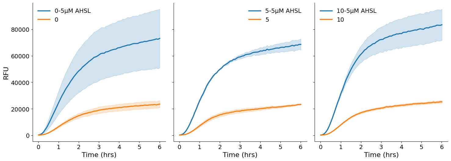
# --- text sizes (raise these to make everything larger) ---
plt.rcParams.update({
    "font.size": 14,           # base size
    "axes.labelsize": 16,      # x / y axis labels
    "axes.titlesize": 16,      # panel titles
    "xtick.labelsize": 14,
    "ytick.labelsize": 14,
    "legend.fontsize": 14,
    "lines.linewidth": 2.5,    # thicker traces to match
})

data_0 = data.select(name=["0-5µM AHSL", "0"])
data_5 = data.select(name=["5-5µM AHSL", "5"])
data_10 = data.select(name=["10-5µM AHSL", "10"])

df_0 = data_0.data
df_5 = data_5.data
df_10 = data_10.data

# original Name in the data -> label shown in the legend
label_map = {
    "0-5µM AHSL":  "0 mM Mg (+ AHSL)",
    "0":           "0 mM Mg",
    "5-5µM AHSL":  "5 mM Mg (+ AHSL)",
    "5":           "5 mM Mg",
    "10-5µM AHSL": "10 mM Mg (+ AHSL)",
    "10":          "10 mM Mg",
}

# label -> colour: blue for -AHSL, orange for +AHSL
palette = {
    "0 mM Mg":           "tab:blue",
    "0 mM Mg (+ AHSL)":  "tab:orange",
    "5 mM Mg":           "tab:blue",
    "5 mM Mg (+ AHSL)":  "tab:orange",
    "10 mM Mg":          "tab:blue",
    "10 mM Mg (+ AHSL)": "tab:orange",
}

for df in [df_0, df_5, df_10]:
    df['Time_hrs'] = df['Time'].dt.total_seconds() / 3600

df_0['Label'] = df_0['Name'].replace(label_map)
df_5['Label'] = df_5['Name'].replace(label_map)
df_10['Label'] = df_10['Name'].replace(label_map)

fig, (ax1, ax2, ax3) = plt.subplots(1, 3, figsize=(15, 5.5), sharey=True)

sns.lineplot(df_0, x="Time_hrs", y='Data', hue="Label", ax=ax1,
             palette=palette, hue_order=["0 mM Mg", "0 mM Mg (+ AHSL)"])
sns.lineplot(df_5, x="Time_hrs", y='Data', hue="Label", ax=ax2,
             palette=palette, hue_order=["5 mM Mg", "5 mM Mg (+ AHSL)"])
sns.lineplot(df_10, x="Time_hrs", y='Data', hue="Label", ax=ax3,
             palette=palette, hue_order=["10 mM Mg", "10 mM Mg (+ AHSL)"])

ax1.set(xlabel='Time (hrs)', ylabel='RFU')
ax2.set(xlabel='Time (hrs)', ylabel='RFU')
ax3.set(xlabel='Time (hrs)', ylabel='RFU')


for ax in [ax1, ax2, ax3]:
    ax.legend(frameon=False)

ax2.legend(loc='upper center', bbox_to_anchor=(0.6, 0.18), frameon=False)
fig.suptitle("Mg titration: 0 mM - 10 mM")


sns.despine()
plt.tight_layout()
plt.show()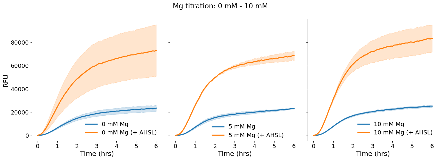
N_LAST_READS = 4   # steady state = mean of each well's last N reads

def steady_state_per_well(df, name):
    sub = df[df['Name'] == name].sort_values('Time_hrs')
    return sub.groupby('Well').tail(N_LAST_READS).groupby('Well')['Data'].mean()

def fold_change_wells(df, base_name, ahsl_name, mg):
    base_mean = steady_state_per_well(df, base_name).mean()   # mean of the -AHSL wells
    ahsl = steady_state_per_well(df, ahsl_name)               # one value per +AHSL well
    return pd.DataFrame({'Mg_mM': mg, 'Fold_change': ahsl / base_mean})

fold_0  = fold_change_wells(df_0,  "0",  "0-5µM AHSL",  0)
fold_5  = fold_change_wells(df_5,  "5",  "5-5µM AHSL",  5)
fold_10 = fold_change_wells(df_10, "10", "10-5µM AHSL", 10)

fold_wells = pd.concat([fold_0, fold_5, fold_10], ignore_index=True)

fig, ax = plt.subplots(figsize=(6, 5))

sns.barplot(data=fold_wells, x='Mg_mM', y='Fold_change', color='tab:orange',
            errorbar='sd', capsize=0.15, err_kws={'linewidth': 1}, ax=ax)
sns.stripplot(data=fold_wells, x='Mg_mM', y='Fold_change', color='black',
              size=4, ax=ax)

ax.set(xlabel='Mg$^{2+}$ concentration (mM)', ylabel='RFU Fold change (+AHSL / −AHSL)')
ax.set_ylim(1, 5)


sns.despine(fig)
fig.tight_layout()
plt.show()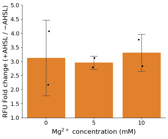
g = kinetics.plot()WARNING:cdk.instruments.platereader.kinetics:Column 'Name' not found — no platemap loaded? Falling back to 'Well'.
Normalize Data
Now, use data.normalize('<standard name>') to normalize your data. This will calculate the average over a time window at the end of the experiment (by default, 1 hour), then divide all data by the mean of that window-average across all wells with the same Name (defined by your platemap).
data.data["Well"].str.contains("B2").any()np.False_if "Type" in data.columns and data.data["Type"].str.contains("Standard").any():
# To check the exact name of your standard
platemap = data.platemap
standards = platemap[platemap['Type']=='Standard']
standards['Name'].unique()
data = data.normalize('10 uM HPTS')
g = data.plot(style='Type', exclude_types=['Standard'])
else:
print("Plate reader data does not contain labeled standards, skipping normalization.")Plate reader data does not contain labeled standards, skipping normalization.
Kinetic Analysis
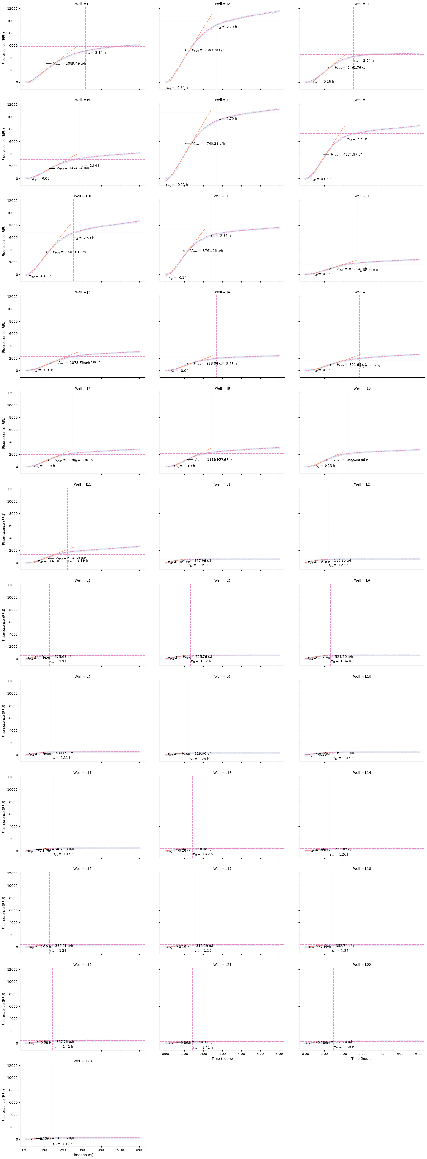
See the DevNote on kinetic analysis for more details.
Metrics extracted:
Maximum velocity: Maximum rate of fluorescence increase (slope at inflection point)
Lag time: Time to reach the exponential phase
Steady-state: Final fluorescence level
Time-to-completion: Time it takes to reach 95% of asymptote
Drift: Rate of signal decay or increase after steady-state
R²: Goodness of fit; “Good Fit” is
Trueif
# Perform kinetic analysis using sigmoid_drift model
kinetics = data.fit_kinetics()
WARNING:cdk.analysis.cytosol.analysis:`Type` column not found in data. All data will be used for kinetic analysis.
kinetics.summaryVisualize Fits
g = kinetics.plot(col="Well")
# g = kinetics.plot() # call this to visualize across replicates
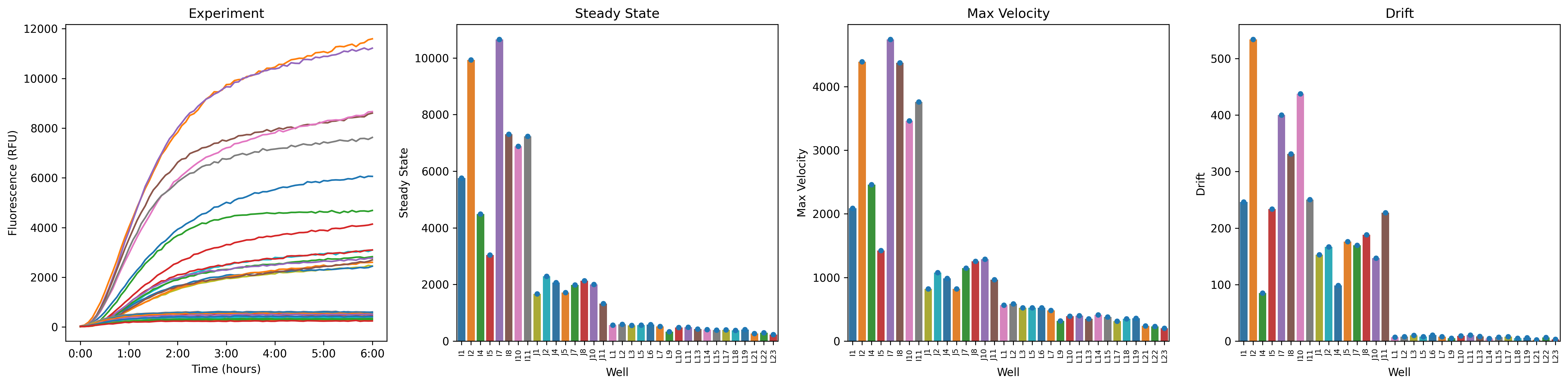
Summary Plots
g = kinetics.plot_summary()WARNING:cdk.instruments.platereader.kinetics:Column 'Name' not found — no platemap loaded? Falling back to 'Well'.
Key Metrics Explained
1. Steady-State Level (Steady State, Data)
The final fluorescence value reached by the reaction
Represents the total amount of protein produced
Higher values indicate greater expression yield
2. Maximum Velocity (Velocity, Max)
The steepest slope of the fluorescence curve (at the inflection point)
Units: RFU per second
Reflects the peak rate of protein synthesis
Sensitive to enzyme activity, substrate availability, and reaction conditions
3. Lag Time (Lag, Time)
Time before exponential fluorescence increase begins
May reflect time for ribosome assembly or initial translation steps
Shorter lag times suggest faster reaction initiation
4. Drift (Fit, drift)
Rate of fluorescence change after reaching steady-state
Positive drift: continued synthesis or aggregation
Negative drift: photobleaching, protein degradation, or quenching
Units: RFU per second
5. R² Value (Fit, R^2)
Goodness of fit (0 to 1, higher is better)
R² > 0.98 indicates excellent fit
Poor fits may indicate noisy data, overflow errors, or non-sigmoid kinetics
Tips and Troubleshooting
Overflow errors: Wells with
OVRFLWorNaNvalues are automatically excluded from fittingPoor fits (low R²): Inspect raw curves for anomalies (bubbles, evaporation, pipetting errors)
Drift: Sometimes seen in kinetics curves; use
sigmoid_driftmodelMultiple replicates: Always include technical replicates and report error bars
Comparing conditions: Normalize or blank data consistently across all samples
Next Steps
Export kinetics results:
pr.export_kinetics(kinetics, 'results.csv')Statistical analysis: Use
scipy.statsorstatsmodelsfor ANOVA/t-testsParameter optimization: Vary Mg²⁺, K⁺, or other conditions to maximize Vmax or steady-state
Mechanistic modeling: Fit ODE models to extract biological rate constants